Choosing Interior Paint Colors: A Guide To Achieving The Perfect Room Mood
Color is one of the most influential tools in crafting the atmosphere of your home. The choice of paint is never just aesthetic; it can mold your mood and even shape your day-to-day behavior. For example, soft greens in a bedroom can evoke a gentle sense of relaxation after a long day. At the same time, a bold red accent wall in a dining room could encourage conversation and appetite among friends and family. The evidence supporting these insights is not merely anecdotal. According to decades of design studies, including references compiled by well-respected organizations, the psychological effect of color on humans is both real and profound. When painted in muted, natural tones, a family room instantly broadcasts serenity and comfort, making it the perfect gathering place for loved ones. Conversely, energizing shades can be used strategically to motivate productivity, particularly in home offices or workout rooms where focus and drive are key.
Even the most functional spaces benefit from deliberate color choices—a perfect example is hiring a laundry room painter. A once-dark laundry room can be transformed by painting it a light, optimistic hue, making chores feel less like a burden and turning the space into a bright, uplifting corner of the home. These subtle but strategic uses of color have ripple effects, relieving everyday stress and supporting mental well-being without requiring a significant renovation or expensive décor updates.
How Lighting Affects Paint Colors
Interior design often neglects the relationship between paint and lighting. Natural daylight can cause colors to appear cooler and more subdued in the morning, while artificial light sources, such as LEDs, can change how colors are perceived. To avoid surprises, professionals and decorators recommend evaluating color samples at different times of day and under various lighting conditions. This hands-on approach ensures no unexpected outcomes after the painting is completed. For example, a tranquil sage green may look drab and dull under harsh lighting, whereas a soft beige could take on a rich, golden hue in the evening lamplight.
Popular Room Moods & The Paint Colors That Create Them
Creating the right mood for each space starts with identifying how the room will function daily. The colors you choose set the emotional tone, guiding your experience and how guests and family members feel when they enter. Aim for gentle colors like powder blue, sage green, or a peaceful gray if you want a truly sanctuary bedroom. These choices work because cool and muted colors have been shown to lower heart rates, helping the mind and body unwind.
- Calm and Restful:For bedrooms and spa-inspired bathrooms, look for watery blue, misty lilac, or even pale ivory.
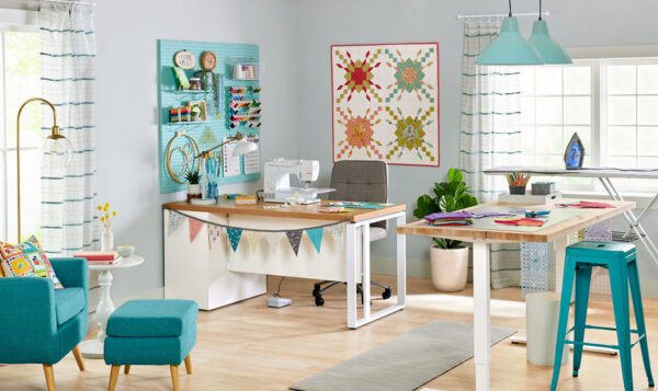
- Bright and Energetic:Lively kitchens and kid-friendly playrooms thrive on crisp whites, citrus yellows, or playful turquoise, helping to energize and stimulate creativity.
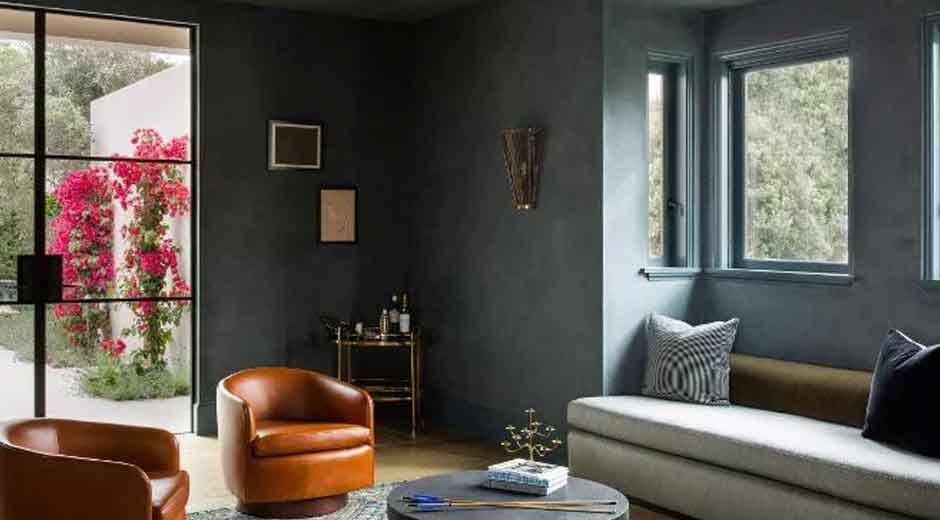
- Cozy and Inviting:If your goal is comfort in your living space, earthy taupe, warm terracotta, or caramel beige create an inviting setting for movie nights or heart-to-heart chats.
- Modern and Minimal:To achieve a clean and contemporary look, stick with high-contrast palettes, such as snow-white walls with matte black trim or cabinetry.
Remember, trends may inform your choices, but your daily rhythm should guide your ultimate decision. For example, an open-plan dining room with lots of evening activity can benefit from warm, saturated hues that glow under soft lights, fostering togetherness and comfort.
Understanding Undertones: The Secret Ingredient
Undertones are subtle hints of a secondary color that affect the final appearance of paint. They can be the difference between a harmonious design and a color clash. Understanding undertones is crucial for achieving a coordinated look. It’s essential to compare paint samples in your home’s lighting alongside permanent fixtures, as paint chips or photos can mislead the eye due to variations in monitor calibrations and print processes. Even experienced designers often place options side by side to identify the undertones at play.
Choosing The Right Paint Sheen
Paint sheen is how much light a surface reflects, influencing its appearance and functionality. Flat and matte finishes are best for bedrooms and ceilings, creating a soft, non-reflective surface. On the other hand, eggshell and satin finishes provide a subtle shine, making them ideal for high-traffic areas. Semi-gloss and gloss finishes are perfect for kitchens because they are easy to clean and moisture-resistant. Additionally, the sheen level can affect colors; for instance, gloss finishes can make a deep blue color stand out, while matte finishes have a more understated look. Choosing the right sheen enhances the color and ensures lasting durability.